Introducing Badge List component, one of our latest Vaadin add-ons, created to address the challenge of displaying a dynamic list of badges within a confined space, such as a Vaadin Grid cell, in a responsive and user-friendly manner.
During our initial analysis, we identified a common issue: as the number of badges increased, maintaining a clean and functional layout became difficult. To solve this, we developed an innovative solution: a responsive Badge List with an overflow badge feature. This overflow badge dynamically appears when the list exceeds the available width, showing a clear count of the hidden badges. By clicking on the overflow badge, users can access a context menu that displays the hidden badges, providing a clear and intuitive way to manage and interact with all badges.
Now, let’s take a brief overview of how to use the Badge List component and explore how it can enhance data representation and user interaction in your applications.
How to Use Badge List
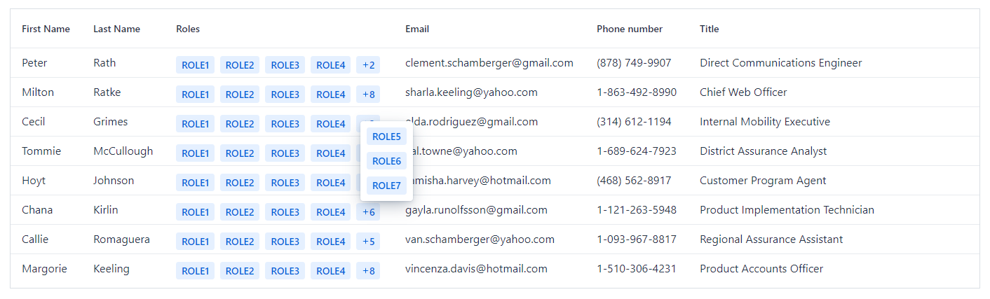
Let’s focus on the original requirement that inspired the creation of this component: displaying a list of badges representing data within a Vaadin Grid cell.
Imagine you have a Grid, and one of its columns needs to display data as a list of badges. Given that this list can contain multiple badges, you want to maintain a consistent and compact column width without sacrificing usability. This is where the Badge List component comes in handy.
By using the Badge List component, you can efficiently manage the space within your Grid columns while ensuring that all badges are accessible and visible, even when they exceed the available width.
Take a look at the following example, a simple Grid displaying people’s data where the “Roles” column uses Badge List. If the list is too long, only a few badges are shown and the rest are available by clicking the overflow badge placed at the end of the list:
Grid<Person> grid = new Grid<>(Person.class, false);
grid.setItems(TestData.initializeData()); // generated data

grid.addColumn(Person::getFirstName).setHeader("First Name").setAutoWidth(true).setFlexGrow(0);
grid.addColumn(Person::getLastName).setHeader("Last Name").setAutoWidth(true).setFlexGrow(0);

// add "Roles" column using Badge List
grid.addComponentColumn(person -> {
   List<Badge> badges = new ArrayList<>();
   person.getRoles().forEach(role -> badges.add(new Badge(role)));
   return new BadgeList(badges);
}).setHeader("Roles").setResizable(true);

grid.addColumn(Person::getEmailAddress).setHeader("Email").setAutoWidth(true).setFlexGrow(0);
grid.addColumn(Person::getPhoneNumber).setHeader("Phone number").setAutoWidth(true).setFlexGrow(0);
grid.addColumn(Person::getTitle).setHeader("Title");

grid.setWidthFull();
Styling
Vaadin offers support for styling badges through theme variants that can be combined as needed. These theme variants can be applied to the badges within the list, providing a flexible approach to match your application’s design.
In addition to the built-in theme variants, you can also define custom styling rules. For instance, you might want to:
- Apply different colors to badges based on specific conditions, such as status or category.
- Alter the shape of the badges to fit your design aesthetics or enhance visual distinction.
- Add icons to the badges to provide additional context or visual appeal.
By leveraging both Vaadin’s theme variants and custom styling options, you can create a Badge List that is not only functional but also visually cohesive with the rest of your application.
Styling in Action
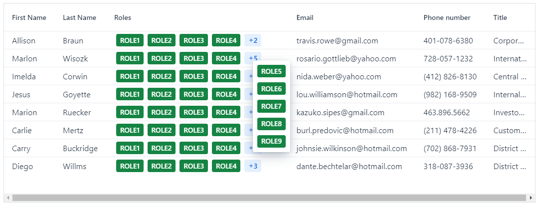
If we want to display the badges from the previous example with a brighter color, we could use the existing variants:
- success: displays a green color
- primary: emphasizes the color
So, we just need to update the example as shown below:
grid.addComponentColumn(person -> {
  List<Badge> badges = new ArrayList<>();
  person.getRoles().forEach(role -> {
	Badge badge = new Badge(role);
	badge.addThemeName("success primary"); // add the theme variants for each badge
	badges.add(badge);
  });
  return new BadgeList(badges);
}).setHeader("Roles").setResizable(true);
And the badges will look like this:
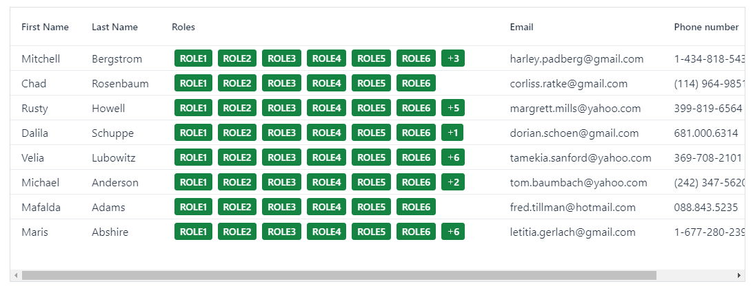
As shown in the image, the overflow badge is not affected by the styling. This is because the overflow badge is a special badge created to display the count of hidden badges. To make it appear with the same color as the other badges, or any other color, we need to style it separately.
The overflow badge has a part attribute named overflow-badge that can be used for styling. To ensure the styling only affects the Badge List within the Grid component, we can define a class name for the Badge List component. Here’s how you can do it:
1 – Add a class name to the Badge List component:
grid.addComponentColumn(person -> {
  List<Badge> badges = new ArrayList<>();
  person.getRoles().forEach(role -> {
	Badge badge = new Badge(role);
	badge.addThemeName("success primary");
	badges.add(badge);
  });
  BadgeList badgeList = new BadgeList(badges);
  badgeList.addClassName("roles-style"); // add class name for badge list component
  return badgeList;
}).setHeader("Roles").setResizable(true);
2 – In your global CSS file, add the following rule to style the overflow badge:
.roles-style::part(overflow-badge) {
    color: var(--lumo-success-contrast-color);
    background-color: var(--lumo-success-color);
}
By doing this, the overflow badge will have the same styling as the other badges in the list, creating a cohesive and visually appealing display:
See more styling examples in our demo site.
Read-only Binder Support
The Badge List component can also be used outside of a Vaadin Grid, such as in a form where you want to display data as badges.
A particularly interesting use case for the component is to use it to represent data in a read-only form that implements data binding through the Binder mechanism that Vaadin offers .
For instance, if you have a multi-selection component and want to display the selected items in a different representation in read-only mode, the Badge List component is an excellent choice.
Take a look at the following example:
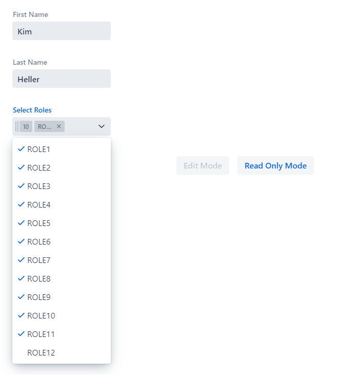
1 – In edit mode, the selection of roles is implemented using a Multi-Select Combo Box:
2 – In read-only mode, the list of selected roles is implemented by Badge List component:
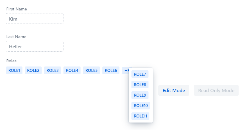
This setup allows you to clearly present the selected data without allowing modifications, providing a clean and informative display.
Please find the complete source for this example in our demo site.
Label Support
The most recent enhancement to the component includes label support. This addition provides users with the flexibility to include a label based on the component’s use case. In the previous example, the Badge List component is instantiated with a label that will be shown when the form is in read-only mode:
BadgeList rolesBadgeList = new BadgeList("Roles");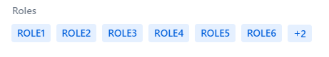
And That’s All… For Now
In summary, the Badge List component offers a versatile solution for efficiently displaying and managing list of badges in various contexts. Its responsive design, overflow management, support for Vaadin Binder make it a valuable addition to any application seeking efficient data representation and user interaction.
Are you ready to give it a try?
Find more information about existing versions and supported Vaadin versions on Vaadin’s Directory site. For now the add-on is only available to use with the latest Vaadin version, 24.
For suggestions on missing features, tracking bug fixes, or following enhancements, be sure to add the GitHub repo to your favorites list and stay updated on the latest developments.
Our commitment to contributing to the open source community by delivering high-quality components is stronger than ever. The feedback and ongoing contributions from the community reassure us that we are on the right path. Please visit our open source section to learn more about all our Vaadin add-ons.
Thanks for reading and keep the code flowing!


Join the conversation!